The landscape of UI/UX is radically changing every year.
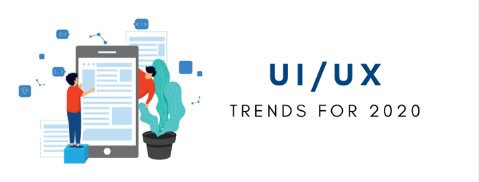
Advances in technology inevitably lead to the rise of new design systems. And because technological advances now come faster than ever, it’s not surprising that new UI and UX trends are constantly surfacing year after year.
To survive and thrive as a designer, you must keep yourself abreast of existing and upcoming design systems and trends. We get it, though — new UI and UX trends can sometimes be hard to predict. Some design systems slowly creep up on us, while others seem to rise to meteoric popularity out of nowhere.
And, of course, we’ll never run out of nine-day wonders that take the design world by storm, only to fade into oblivion just as rapidly as they rose through the ranks.
However, being in the industry for quite some time certainly makes it easier to distinguish which potential design trends show actual promise. That said, here are 6 UI/UX trends to watch out for in 2020. Let’s jump right in!
1.) Unique Storytelling
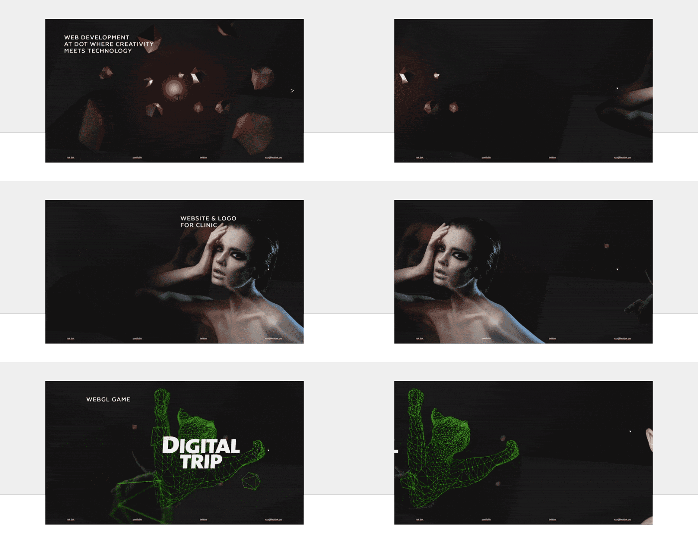
In order to build meaningful relationships with your audience, it’s important to make them understand who you are, what your core values are, and what your brand stands for. This is why incorporating storytelling elements into the user experience will be a big trend this year.
Storytelling is all about communicating with your users in a creative, engaging, and subtly personal way. Stories are a great way to bring out positive emotions. They make a brand more memorable and seem more relatable, therefore enhancing the user experience.
Storytelling doesn’t always have to involve full-blown videos about your brand. It could be as simple as using animations, interactive elements, and meaningful photos and illustrations in your design.
My personal favorite manifestations of unique storytelling make great use of the scroll bar and animation. Apple does a great job with this when they showcase their different products. When I was doing Frontend Development at Zuora I was able to make this minimal scrolling effect on Zuora's IOT page.

These scroll effects can also be a great way to attract talent to your company. When engineers and designers see non-conventional but effective ways to show off products, it says a lot about the business. Before every interview you conduct, your candidates are looking at your home page. This can be a great way to sell to them as well as your customers and clients.
2.) Neumorphic Designs
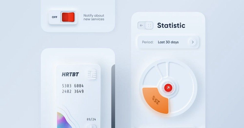
We’ve all seen how skeuomorphic design has contributed to the UI designs that we’re seeing today. And from the looks of it, it seems like skeuomorphism is making a comeback in the form of neumorphism a.k.a. “New skeuomorphism.”
Neumorphic designs are all about manipulating shadows, glows, and highlights to achieve a precise- and clean-looking interface. A lot of designers are already moving away from the modern design systems we’ve seen last year and towards neumorphism — and it’s easy to see why. Neumorphic designs are uncomplicated, but definitely refreshing to the eyes.
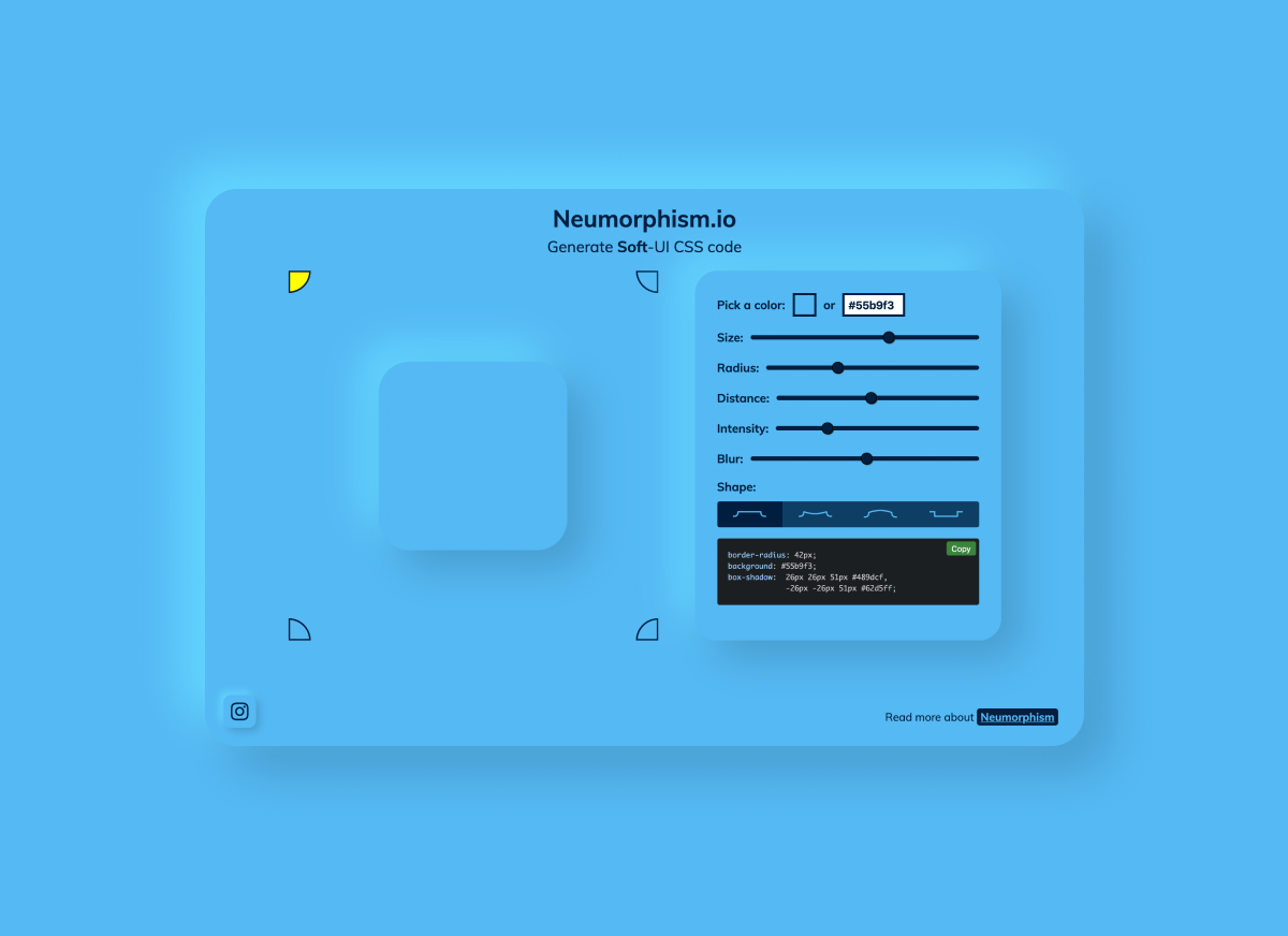
If you’re looking to experiment with this, check out neumorphism.io to play around with different color palates.
3.) Animated Illustrations
Different types of illustrations have always been a vital part of digital product design. Not only are they excellent for capturing and holding user attention, but they also add that coveted human touch to the user experience.
This year, expect to see more animated illustrations than ever. Aside from the benefits outlined above, animated illustrations also happen to tie in nicely with the storytelling trend that we’ve mentioned previously. Simply put, applying motion to illustrations makes it easy to tell a story about your product or services.
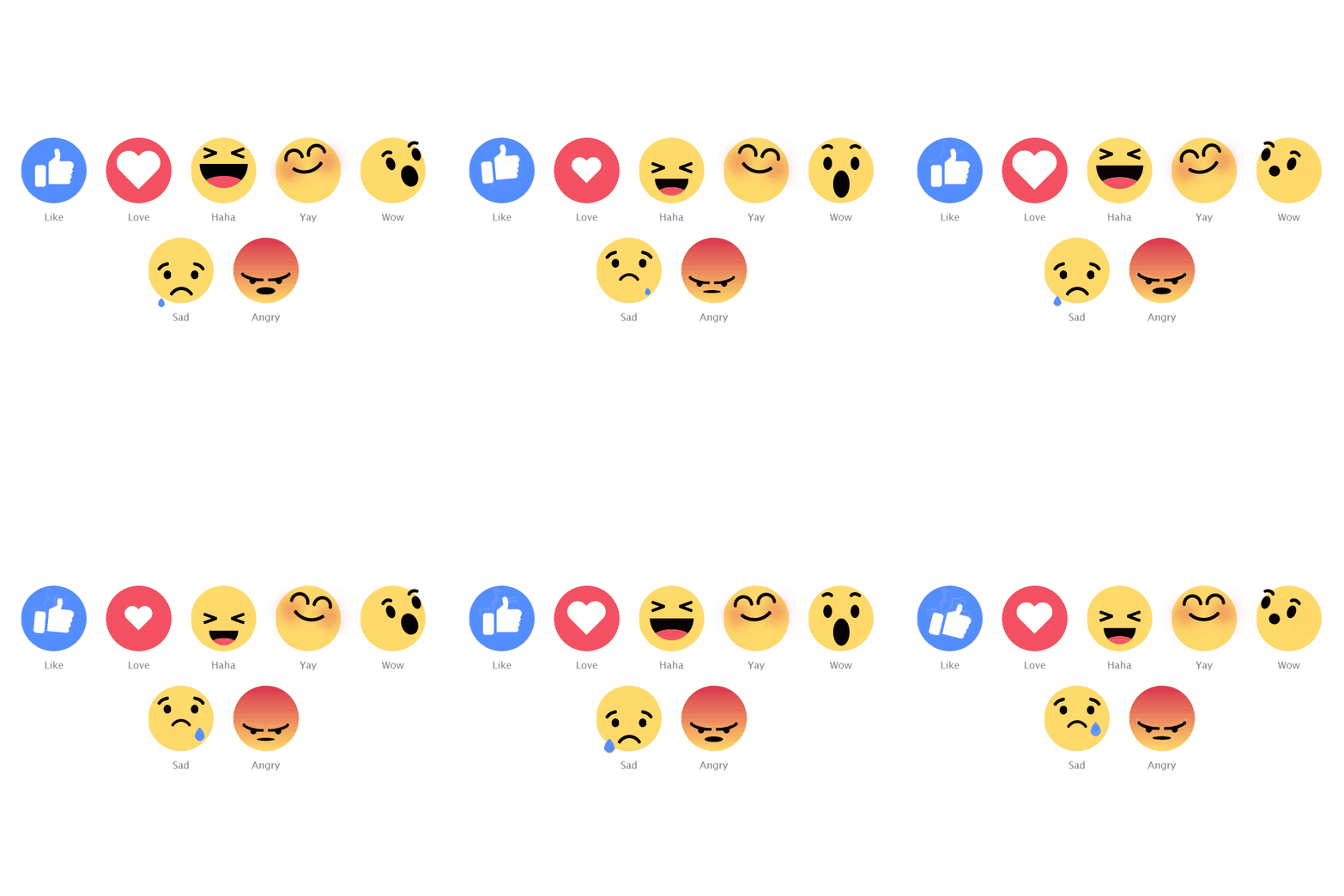
A great way to get started with this is with Lottie, a library that renders After Effects animations in real time, allowing apps to use animations as easily as they use static images. You can even tie lottie animations with the scroll bar as discussed in our first trend.

Lottie was developed by AirBnB so it’s not going anywhere. Additionally, Facebook has also adopted it, in the form of animating reactions.
To see the capabilities of Lottie, check out lottifiles.com, or see this codepen to view the power of Lottie animations in action.
4.) AI Integration
In 2020, you can expect AI to be integrated into a few digital products. User experiences that are tailored to suit every user’s individual needs and preferences will continue to be popular. Machine learning will take personalization to the next level. Plus, improvements in UX will rely heavily on products digesting large volumes of data and learning more and more information about users.
And no, AI will not replace UX designers. So before you get tempted to look for new career paths, know that welcoming AI with open arms will actually benefit your work. Instead of spending a lot of time and resources trying to chase down your customers and collect user feedback (or input about their preferences), AI will automatically learn these things for you. As a result, you’ll be able to focus more on crafting and designing smoother experiences that are enriched specifically for your audience.
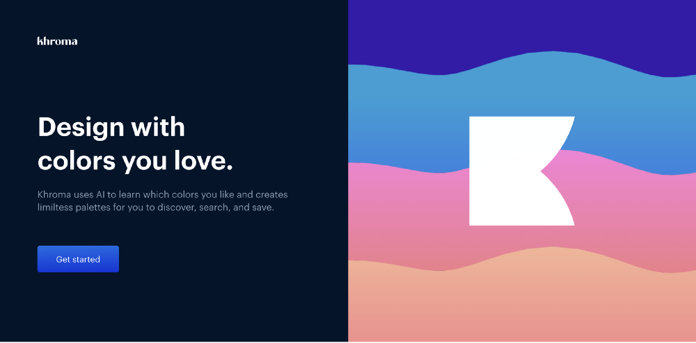
Some of these new AI integrations are built directly for designers. Tools like Khroma, which helps designers pick color schemes with AI are starting to become more popular. Using these tools could work as a great asset to you.
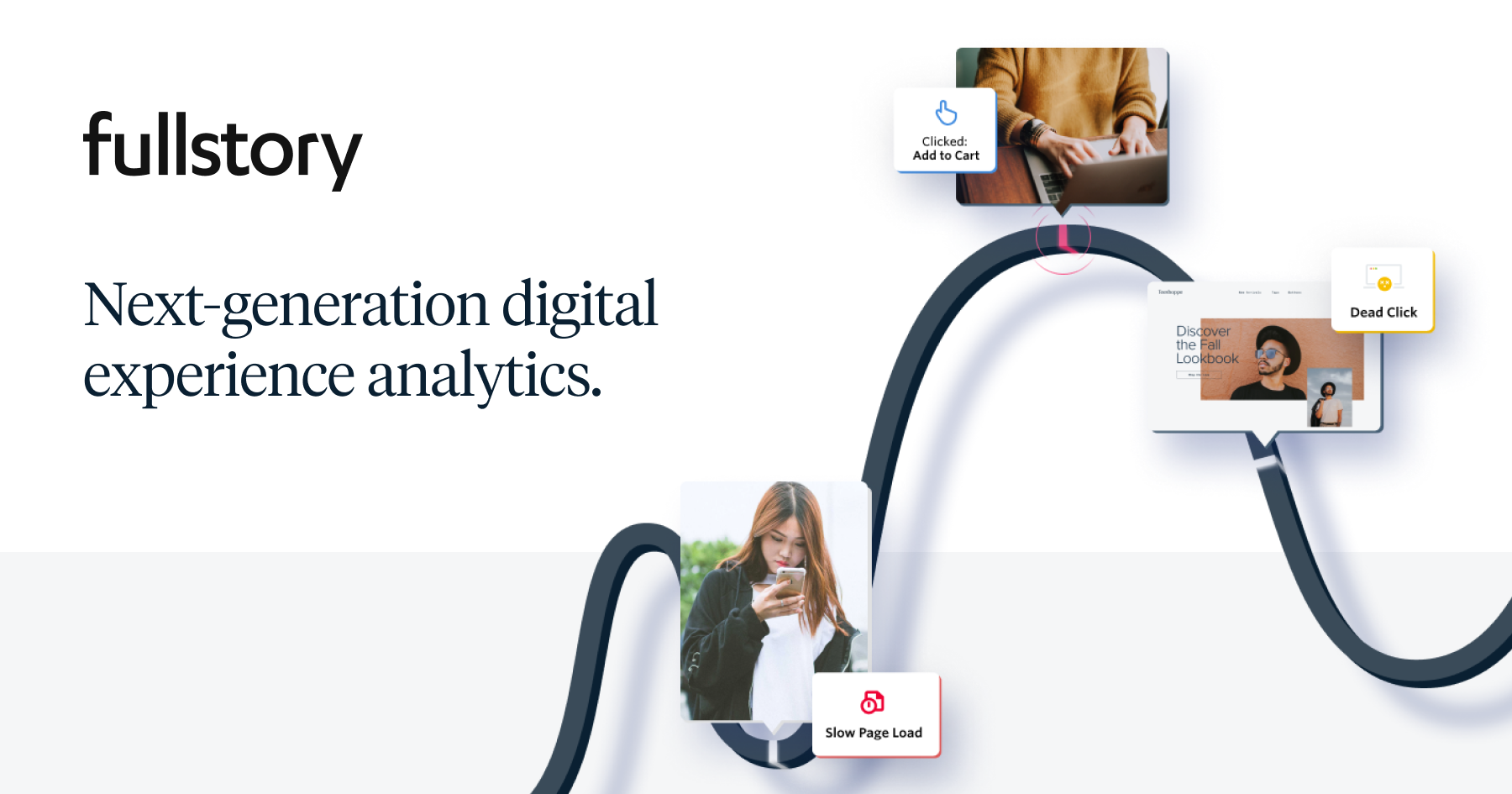
Less scary alternatives to AI Integration are third party tools like FullStory and Pendo, which allow designers and front end developers to see how their users interact with their apps and websites. I’m a big fan of these services, and they are much more accessible to the average company than investing in a data science team just for UX.
5.) The Rise of the Blob
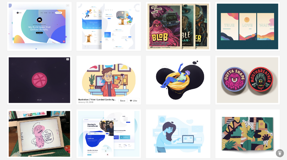
If you browse landing pages for different startups as often as I do, you’ll begin to notice certain trends. My personal favorite is the blob.
They first started to appear in 2017, and now we can’t seem to get rid of it. One of my favorite ways to experiment with these blobs is by using this tool made by z creative labs: https://www.blobmaker.app/
Along with the rise of the blob, we also see wavey dividers between sections of content. No longer are websites using straight lines. If you’re looking for a sure-fire way to fit the start-up aesthetic, this would be it.
I even use these blobs on my personal portfolio page.

6.) Asymmetry Is In
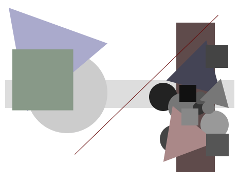
Conventional template-based layouts have faded in popularity last year, and in 2020, things won’t be that much different. Asymmetrical layouts will continue to grow in number this year. More and more users and designers will become appreciative of the added character and dynamism that asymmetry brings to digital designs
Pay attention, though: asymmetrical designs can be tricky to pull off. Doing away with templates and traditional layouts will give you more room to exercise freedom and creativity, but it’s definitely not an excuse for you to randomly place whatever elements on the grid.
So before you execute an asymmetrical layout in your next big project, make sure you’ve had plenty of practice. Remember: you have to strike a balance between enjoying the endless number of options that come with asymmetry and making sure that your users don’t get lost while using your product.


